Outstreched arm

Thursday, March 08, 2007

Spicing up iPhone's black background

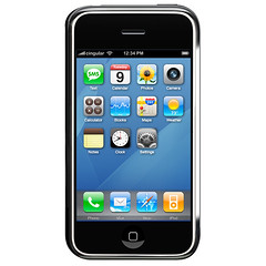
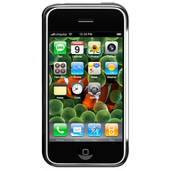
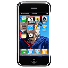
I was wondering why the Home view on the iPhone features a flat black background. It saves battery, I suppose, but it's also a little boring. Here are some quick mock-ups of what it would look like with background images.

Click for full-size.

iPhone with blue swoosh "desktop" background
Nice, but feels like bastardized Mac OS X.


iPhone with Nemo "desktop" background
Colorful, but too busy.


iPhone with my "desktop" background
Way too busy.


I actually prefer the black. Can you do better?

All images here are Apple's. No hard feelings?

Labels: , , ,

Wednesday, February 28, 2007

Dumpster art in Dunedin

In June 2004, my brother Daniel heard from a former design professor who was an art council member of some sort for the nearby city of Dunedin, FL. The city had an eyesore problem: the cozy downtown area, usually filled with on-foot tourists, featured three giant waste receptacles (i.e. dumpsters) right by a popular bike trail. They had to have them there for the myriad local restaurants to use, so they thought, hey, instead of fencing these ugly things off, let's decorate them with "art." The city posted a call for submissions and Daniel and I thought we'd give it a shot.

Two other artists were considered and we were all invited to present our ideas to the council. In all modesty, I think we did a good job of it. Daniel's designs were jovial, colorful, and interesting, and we did something I advise every designer to do when working on a piece that will be displayed in some large, public manner: we put together mock-ups of what the illustrations would look like on the actual dumpsters. It took five minutes to take some pictures and ten minutes of layer work in Photoshop, and it seemed to make all the difference - the council people kept praising the idea of showing the finished work. Apparently another artist had just brought in a bunch of photorealistic paintings without much consideration for how this would look on the side of a big, green, irregularly-shaped hunk of stinky metal.

We got the contract and were given keys to a giant city-owned garage downtown. They delivered the dumpsters and gave us a month to make them pretty. It was a fun month - we'd drive over before and after work, slap some paint on, and sweat to my iPod in a non-airconditioned tin box in June. We were done well before schedule and everyone seemed very pleased. You can see the process documented in photos in the set below. Good times.

Photoset at Flickr.

Labels: , , , ,

Friday, December 22, 2006

Some people actually *like* the Adobe CS3 icons

Like this guy.

Look, I don't care that the icons are "recognizable" now. A series of flat squares of different colors would sure as heck stand out in the Dock and be distinguishable as well. How's that - just remove the two-letter abbreviations. No one calls Adobe Bridge "Br" anyway. And what's "Jr"? Junior what?

Also, notice all the non-letterized icons. They make the key point in this miserable failure: if Acrobat Reader's funky triangle is so well known that it should stay its own symbol, how about focusing on creating equally impressive icons for the rest of the suite? I thought that's what icon designers did.

The most frequently repeated cliche in marketing is that any exposure, even exposure that provokes negative reactions, is good for the business. It's baloney. Regardless of that, though, and regardless of the recognizability of these icons touted by some people who need to go easy on the crack, can we agree that this is ugly? Even if it magically increases your productivity by .8%, please admit that it's basically non-design.

Labels: , ,

Thursday, November 09, 2006

Why there won't be a red Mac

Almost as soon as the new red iPod was announced, rumors started spreading of other possible product(red) products (in red). Here's why I'm willing to bet my hat that a red iMac, Mac mini, or MacBook will never happen:

AppleInsider MacBook RED poll, with a mock-up

And another one, found via Google.

That thing looks absolutely scary. Both the MacBook's plastic and the MacBook Pro's aluminum would just look very off in red. They're also simply far too big for all that saturated color; a 15" object won't look candybar no matter how you paint it.

Labels: , , , ,

Wednesday, November 08, 2006

Different sections of Apple's website

Describing how and why Apple Computer's design (and design philosophy) is fantastic would be a waste of keystrokes. Just take my word for it: they can put things together with elegance, originality, and consistency rarely seen elsewhere. This extends to Apple.com, which, while always a work in progress (like every website), has been particularly stunning lately.

Page after page, it's perhaps the best adaptation of glossy print design to the web; when I say best, I again mean the prettiest, most useful, and most skillfully coordinated. There are more impressive designs out there; there are technically more involved ones; there are much, much bigger computer companies. But compare, for instance, Apple's notebook portal page to Dell's. It's a fair comparison; both Apple and Dell would agree with that. Maybe I'm just too lazy to spell out what all makes the MacBook page incomparably better, but I really don't think it needs to be spelled out at all.

That said, some key sections of Apple.com are surprisingly unimpressive. I understand why Hot News is stuck in 1996; nobody cares about it anyway. But what about the seemingly very, very important Hardware section? No product images, no flowing, magazine-like layout? The partner section, Software, follows the same underachiever formula. These are key portals to Apple's goodies, and pretty much all other sections look better - including the store locator and Developer announcements (Lord knows most devs don't care what this looks like... but kudos to Apple for not bowing to that stereotype.)

It might be that few people browse the site in this way. The big (and usually excellent) front-page ad and its tiny children below point to what almost all visitors are looking for: the new iPod, the MacBook upgrade, the latest ad or Stevenote. Those looking for something else will go to the Store or the Support page.

So here are my suggestions to Apple (and I'm very aware of the pompousness of that statement):

  • make your Hardware and Software pages lickable.

  • Compress that scattered footer found on most of your pages; I appreciate the white space, but I cringe at the lack of grid, balance, and composition in it. Also, those default blue links have to go. The .Mac page is on the right track.

  • Widen the Store page; it's still in 640 x 480 land, while most of your site has expanded way beyond it.

  • Lose the menu pinstripe. I know, I know. They grow up so fast.

  • RSS is orange - that's been decided. Drop the blue and ride with it. This applies to Safari and the rest of the desktop as well.

  • Spice up the Retail pages; they're not bad, but they just don't make me want to visit and shop as much as pretty much everything else on the website does.

Labels: , , , , ,