Outstreched arm

Monday, November 27, 2006

Hello from Seattle, a roll of eyes from Cupertino

I won't make fun of Microsoft for the way its Zune tries to out-iPod the iPod.

(Oh, Microsoft makes the Zune? - Aha. I know the packaging doesn't say it, but yeah, totally.)

There are three reasons: 1. Everyone's doing it, 2. If you have to copy a music player, copy the iPod, and 3. A lot of iPod's features are rather obvious and don't need to be reinvented.

But I will offer a pitying chuckle at the way Microsoft just can't come up with anything new or interesting (let alone sweet) even when they're trying to be nonchalantly friendly.

Here's the back of the Zune. And if you thought that was only similar to Apple's "Designed by Apple in California" in spirit, here's something of Apple's it's more similar to in a more literal way: the Apple Mail icon.

Labels:

Tuesday, November 14, 2006

Another obvious symptom

Upon arriving at work yesterday, I realized I had forgotten my cellphone at home. This was inconvenient since I was supposed to call my dentist. My first instinct was to ask a co-worker for her cell phone to place the call. It took several seconds of staring at the puzzled look on her face for me to realize that my office had a corded, land-lined, garden-variety telephone.

Labels:

Friday, November 10, 2006

Enabling the "Edit in external editor" menu option in iPhoto

While iPhoto is neat for basic photo editing, I primarily use Photoshop for serious adjustments (love that Shadow/Highlight tool). I was surprised to find that when I Ctrl-clicked my photos, the "Edit in external editor" option was grayed out. Here's how to set it up.

In iPhoto Preferences, under General, set "Edit photo:" to "External editor" (this controls what happens when you double-click thumbnails). Pick Photoshop (or whichever application you plan to use). Close Preferences.

Now, I normally set this option to "Using full screen" because it's a very smooth, distraction-free environment for basic tweaking. We set the above option just so it would show up in the context menu when Ctrl-clicking a photo. Try it now - "Edit in external editor" will be available.

You can now go back to Preferences and change the "Edit photo" option to anything else - the external editor has been set and the option will always be available.

Labels: , , , ,

What do iTunes star ratings mean to you?

Rating things on a five-point scale is never easy, yet it's a system convenient enough that film critics, wine connoisseurs, and Rolling Stones all over the world use it. Here's what I mean when I rate songs in iTunes (this also applies to rating photos in iPhoto and similar systems):

[no rating]    I never got around to rating this song, or I haven't made up my mind yet. This should be looked into.

There is something wrong with this song. It's terrible, or the file is broken, or the tags are wrong, or it's some 45-minute experimental piece. In any case, I don't want it to shuffle on or show up in my playlists and I should look into why it's in my library at all.

This is a bearable song. I don't hate it; if it comes on, I'll likely skip it, but it's basically earned its stay in my music library.

This is a good song. I want to hear it here and there even if it's not exactly a favorite.

This song is sweet. I want to hear it frequently and it's very unlikely that I'll skip it or remove it. (Note: songs often flip between three and four stars)

This is a classic. It's either a masterpiece or a track very dear to me. I want to hear it, but careful with it - it may play too often. This should be used sparingly.

Labels: , , , ,

Thursday, November 09, 2006

Why there won't be a red Mac

Almost as soon as the new red iPod was announced, rumors started spreading of other possible product(red) products (in red). Here's why I'm willing to bet my hat that a red iMac, Mac mini, or MacBook will never happen:

AppleInsider MacBook RED poll, with a mock-up

And another one, found via Google.

That thing looks absolutely scary. Both the MacBook's plastic and the MacBook Pro's aluminum would just look very off in red. They're also simply far too big for all that saturated color; a 15" object won't look candybar no matter how you paint it.

Labels: , , , ,

Wednesday, November 08, 2006

Different sections of Apple's website

Describing how and why Apple Computer's design (and design philosophy) is fantastic would be a waste of keystrokes. Just take my word for it: they can put things together with elegance, originality, and consistency rarely seen elsewhere. This extends to Apple.com, which, while always a work in progress (like every website), has been particularly stunning lately.

Page after page, it's perhaps the best adaptation of glossy print design to the web; when I say best, I again mean the prettiest, most useful, and most skillfully coordinated. There are more impressive designs out there; there are technically more involved ones; there are much, much bigger computer companies. But compare, for instance, Apple's notebook portal page to Dell's. It's a fair comparison; both Apple and Dell would agree with that. Maybe I'm just too lazy to spell out what all makes the MacBook page incomparably better, but I really don't think it needs to be spelled out at all.

That said, some key sections of Apple.com are surprisingly unimpressive. I understand why Hot News is stuck in 1996; nobody cares about it anyway. But what about the seemingly very, very important Hardware section? No product images, no flowing, magazine-like layout? The partner section, Software, follows the same underachiever formula. These are key portals to Apple's goodies, and pretty much all other sections look better - including the store locator and Developer announcements (Lord knows most devs don't care what this looks like... but kudos to Apple for not bowing to that stereotype.)

It might be that few people browse the site in this way. The big (and usually excellent) front-page ad and its tiny children below point to what almost all visitors are looking for: the new iPod, the MacBook upgrade, the latest ad or Stevenote. Those looking for something else will go to the Store or the Support page.

So here are my suggestions to Apple (and I'm very aware of the pompousness of that statement):

  • make your Hardware and Software pages lickable.

  • Compress that scattered footer found on most of your pages; I appreciate the white space, but I cringe at the lack of grid, balance, and composition in it. Also, those default blue links have to go. The .Mac page is on the right track.

  • Widen the Store page; it's still in 640 x 480 land, while most of your site has expanded way beyond it.

  • Lose the menu pinstripe. I know, I know. They grow up so fast.

  • RSS is orange - that's been decided. Drop the blue and ride with it. This applies to Safari and the rest of the desktop as well.

  • Spice up the Retail pages; they're not bad, but they just don't make me want to visit and shop as much as pretty much everything else on the website does.

Labels: , , , , ,

Tuesday, November 07, 2006

Google/Blogger labels vs. Flickr tags

I was very pleased to see the new Blogger Beta, integrated with Google Accounts and adding some new capabilities. The features aren't killer and they won't convert anyone from Wordpress or Movable Type, but I was happy because it showed that Google wasn't burying Blogger (an impression I'd gotten from its complete stagnation for more than a year).

One feature any self-respecting web service of 2006 should have is tags, and Blogger now has them in the form of "labels", previously seen in Gmail, Google Reader, Google Bookmarks, and others - well, kind of. There are differences between Flickr's approach and Google's. Here's a quick overview. Keep in mind that Google's labels are still implemented inconsistently and spottily.

  • Flickr tags are completely ad hoc; they can be added to existing items with the fewest clicks possible.

  • Google's labels are, for the most part, defined ahead of time, then applied to items. The new Blogger labels can be created on the fly, however.

  • Flickr tags can be created by other users, not just the author. There is no such functionality with Google labels for now.

  • When entering more than one tag on Flickr, you can space-separate them; for instance, type in cat animal pet to add those three tags. Multi-word tags are quote-enclosed; for instance, cat "mister paws" pet, though it appears that the better way to do it is to just runthewordstogether since this happens to quoted multi-word tags anyway.

  • In Blogger, you comma-separate tags. This allows you to enter mac, apple ipod, but it confused me at first so I ended up with giant single tags like apple mac ipod tech nerd software. Personally, i prefer the ease of entering of Flickr tags.

Overall, Flickr has a better, simpler, more thoroughly implemented tagging system. Google's just getting started, though; once their labels - and, personally, I also prefer the term "tag" - are used across their services in some interchangeable way, I foresee good things.

Labels: , , ,

Saturday, November 04, 2006

Handmade iPod Nano sock

I like iPod socks.

There, I've said it, come whatever hell may. Hard plastic and rubber cases will protect your pod-dude well, but they're a pain to remove. Why remove them at all? Because I want to use my iPod the way it was meant to be used, without some condom in the way.

Still, when I'm carrying my iPod in my bag I'd like to protect it against completely unnecessary scratches. Another option would be getting one of those gaudy leather cases; uck.

Enter the iPod sock. Soft to the touch of your hands and to your iPod's screen. Now, I'm not saying you should go out and buy Apple's iPod socks. I'm saying you should go out and make your own.

Here's mine - for it, I recycled an old sweater I'd outshrank (yay weight loss). The inside is lined with protective pleather, also reused from the elbow pads of a terrifying denim jacket. The iPod slides in and out easily, but the sock is snug enough not to drop it on its own.

red iPod Nano sock, handmade


Also, when I say "I" made it, that means that "I" sewed it under Christa's supervision.

Labels: , ,

Friday, November 03, 2006

iPod Shuffle sync speed problem (2G version)

iPod shuffule sync speed problem
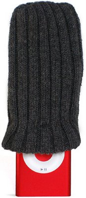
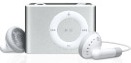
My friend Dino wanted a small, no-nonsense music player for jogging and such and I recommended the new Shuffle, out today. It's tiny, it's simple, it's beautiful.

Dino also asked me to show him how to work this in iTunes (he's got a PC and listens to CDs). We hooked it up, picked a playlist of about 20 songs, and hit Autofill...

...and spent the next 10 minutes staring at the "Updating..." screen. It took about 20 seconds to transfer a single song! This definitely smelled fishy, so I resynced the Shuffle with my PowerBook (thinking it was an issue with Dino's USB port), but the slowness persisted.

I found the answer on Apple's support forums, and here it is in case you don't find it there yourself:

When you connect the iPod and click on it under Devices, under the Settings tab, there's a checkbox to "Convert songs to 128 ACC", meaning, to reduce the quality and filesize to fit more songs on the cute li'l thing. Nifty, but also quite unexpectedly slow. Unless you absolutely need loads of songs for your gym run, you'll probably prefer better transfer speeds.

Labels: , , , ,

Redundant product descriptions on RadioShack's website

Where do you look when you need a 12" shielded stereo audio cable, and you can't wait to order online? RadioShack, of course, that street-corner Library of Alexandria of dorktronics. For the most part, the site is usable and its search returns relevant results, nicely presented (unlike, for instance, Best Buy's goofy search). One thing that stands out, though, is the way product descriptions are put together for small, simple objects. For instance:

1/4" mono Panel-Mount Audio Jack (2-Pack)
$2.99
Model: 1/4" Open-frame open-circuit panel mount
Catalog #: 274-252

A pair of jacks.

This open-frame, open-circuit accepts 1/4" mono phone plugs. Package of two.

* Panel-mount
* Open circuit
* Package of 2

What's in the box

* 1/4" Open-frame open-circuit panel mount (2)


Or:

12-Inch Shielded Stereo Audio Cable
$4.99
Model: 42-2497
Catalog #: 42-2497

Put it on the card.

This 12-inch, shielded stereo audio cable will connect audio components to your computer's sound card. It has an 1/8" stereo phone plug on each end. Use it to hook up a speaker system, mini stereo or other components.

* 12-inch stereo audio cable has an 1/8" stereo phone plug on each end
* Connect a speaker system, mini stereo or other components to your computer's sound card

What's in the box

* 12" Shielded Stereo Audio Cable (1/8" stereo phone plug to 1/8" stereo phone plug)


I'm not really complaining - more info is better than less, but it's a little goofy to read.

Labels: , , ,

Wednesday, November 01, 2006

New Pizzle

I treated myself to a new iPod Nano (PRODUCT) RED (which is a red iPod Nano product) and I'm loving it - the thing is hilariously small, light, and thin, the battery lasts forever, and the screen is sharper and brighter than Mark Twain.

I'm also liking the new iTunes, version 7. I haven't experienced any problems reported by many others, so I can only recommend it. The new iPod options interface is a very welcome change - the gray dialog box of v.6 was getting very, very cramped. I hope they play with the looks of it a little more to make it less webpage-like (I suggest making it more like the beautiful Apple product pages), but it's a nice little iPod Central.

Another welcome addition is a nice, big picture of my iPod. However, I was ever so slightly disappointed to find that it was a generic gray instead of red like my actual iPod. Couldn't this be figured out from its serial number? C'mon, Apple....

...And sure enough, with yesterday's iTunes 7.0.2 update, this feature was added. Here's what my wine-red little toy looks like in iTunes now:

red iPod in iTunes source list

red iPod in iTunes

Labels: , , , , ,