Outstreched arm

Saturday, May 05, 2007

Killer of Sheep is, alas, no classic

I really don't want to be mean to Charles Burnett's Killer of Sheep. I don't hold a grudge against the movie; it didn't upset or offend me. But even if the hype hadn't been so hyped, and even if the expectations hadn't been so high, the movie would've done the same to me: bored me to death.

It's a detached, semi-documentary depiction of life in the Watts in the late 70s. That's about all that's clear about it. It proceeds as a mix of student-film footage, complete with entire scenes set to soul and jazz standards, and very clumsily scripted, acted, and directed vignettes which aim to capture the lives of honest folk in an unfair world. The aim is sincere, but it misses the mark of realism - and most of the time, it misses the targeted emotional impact as well. The student-filminess brings that charming naiveté to many of the setups, and the grainy, muddy photography is often touching; however, it's just as often dull and needlessly opaque.

What all this reminded me of the most is Scorsese's Who's That Knocking At My Door, another amateurish film bursting with developing talent and riddled with cringing mistakes. Killer of Sheep is an important document, in many ways. But it's a sheep in a feature length's movie skin, and as such, it's barely competent, let alone impressive.

Labels: ,

Saturday, April 21, 2007

Mini-review of "Fracture"

Fracture had a really cheesy script and poor Anthony Hokpins gets to play, like, Hannibal Lecter Lite(tm), but there's a lot to like about it too. Some of the smaller scenes are really well done, and Ryan Gosling rolls in with his Half-Nelson hangover and steals the heck out of the movie.

By the way, Gosling's vulnerable confidence (or what do you call it? Casual weltschmertz?) may get old very soon, but right now it's a very enjoyable new piece of acting.

Labels: ,

On Hofstadter's "I Am A Strange Loop"

I wrote this in an email to my friend Bill:

Speaking of books, I just finished Hofstadter's new work, I Am A Strange Loop. It's a strange book, indeed, though I guess that's just par for Hofstadter's course. His wife's death seems to have affected him quite a bit (most obvious sentence ever written?) His books following it are noticeably lacking in humor and wit. That's understandable, but also unfortunate.

It has many intriguing and entertaining parts, and he advances a novel idea or two, but it feels a little slapdash. It's puzzling to read a book of his that doesn't feel all that well... "organized", shall we say. Or perhaps that's the most Hofstadter thing about it. GEB certainly suffers from a similar lack of focus and outline, but it works in its charming, funhouse way.


Long-time followers will find much to appreciate but if it's your first book by him, you might go, Who is this guy and what's the big deal?

Labels: ,

Monday, February 26, 2007

A perfect example of what happens when you don't have a designer

Adriano here, hijacking Neven's blog for a bit of a design-rant-cum-identity-review.

Recently, Cedae, the state-owned company that provides Rio de Janeiro with water and sewage services, introduced a new logo as part of a "major brand restructuring". Even though their previous logo was instantly recognised by anyone in the entire state and performed well on settings as diverse as cast iron manhole covers and sponsor placards at football stadiums, the company felt the need to get with the times and present a new, fresher image. Their process for doing this, however, is a perfect example of how not to do it. I've seen my fair share of botched redesigns (refer to Neven's July '06 post for perfect examples), but this takes the cake. Instead of taking the usual path of hiring a design firm and doing a full identity package, Cedae decided to completely do away with the overpaid turtleneck-clad, buzzword-preaching types and go straight to their own employees. That's right. For a while, Cedae employees could submit their own ideas for the company's new logo, the best of which would be selected by a group of managers (still no designers involved) to replace the 30-year-old workhorse.


Cedae's now defunct logo.


The result, as one would expect, was a complete trainwreck. The new logo, if it can even be considered as such, is a masterclass in conceptual frailty and complete disregard for real-world applications. It looks like something a 10-year-old would do for a school project. No, scratch that, I think my cat makes better-looking stuff in her litterbox.


Don't say I didn't warn you.


Any manager with half a brain and an iota of aesthetic sense would stop this idea dead in its tracks, but that would be too good. This logo made its début in Rio last week and Cedae is now working with an advertising agency to create a style guide outlining the usage of the new brandmark.

It's interesting to point out, however, that the end result is merely the tip of the iceberg here. The people who submitted their ideas in the contest aren't to blame for the disaster that followed. It's all in the process. Why would the managers trust their employees, who are not designers, with redesigning the company's logo?

Rio's energy utilities company also went through a recent rebrand, but luckily they did it the right way. Instead of drastic change, they opted to keep the recognisable values of their old logo, while making it look fresher and more in line with the times. And they hired a design studio to take care of the whole process.


Light's old logo, introduced in 1966.


The new brand keeps the overall shape of the old logo, but with a fresher feel.


This post was inspired by Dr. Mauro Pinheiro's article in Portuguese on Feira Moderna. If you speak Portuguese, I strongly recommend you read his article for a far better and broader look at this whole imbroglio.

(Neven: It's quite an instructive disaster, actually. If your only guideline for creating a logo is not to do anything Cedae did - managerially - or anything their logo does - graphically - you're off to a good start. My favorite part of the, uh, design, is the attempt at conveying ripples of water. Now when I look at it, I envision turds swirling down a toilet bowl in Rio.)

Labels: , , ,

Thursday, February 15, 2007

Pan's Labyrinth is a ridiculously dumb movie

I love a good fairy tale, and I love FX fests even if the visual candy comes at the expense of storyline, acting, and plain old sense-making (I'm looking at you, Argento, you goofball). Gritty, realistic dramas often purposefully dumb down the visuals to play up the story, so visually-centered films should be able to mirror that and grungify the narrative. I mean, look at Antonioni.

But wait, none of this has anything to do with Guillermo del Toro's Pan's Labyrinth. The previews sure made it seem like a fantastic extravaganza of fauns, fairies, labyrinths, and, umm, ok miscellaneous other magical entities and settings. Not only is it not that; it's dumb, bewildering, frustrating, and entirely devoid of wonder.

It features two story lines: in the real world - Spain, 1944 - a remarkably unremarkable girl called Ofelia moves with her pregnant mother to a military outpost in the woods, run by The Captain (of general Franco's Generic Sadistic Assholes forces). Ofelia attempts to escape the harsh realities of World War II by fantasizing away into a labyrinth - I mean a book - I mean a door in her wall - oh what the hell, just arbitrary fairy tale locations. We are treated to a few brief (and disjointed) excursions to this underworld, which make up some sort of series of tasks for Ofelia, though the rules and motivations behind it all are, shall we say, hazy.

That's it for the magic - really. She gets a key from a toad, a knife from behind a lock, and eats grapes she was clearly instructed not to touch, a pointless rebellion for which she gets chased by a cool-looking but ultimately harmless geriatric monster. Lesson learned?

A good eighty percent of the movie, however, consists of The Captain dealing with resistance fighters in the nearby woods while announcing menacingly at every occasion his intent to merely harvest Ofelia's mother for a proud male offspring. As muddy a villain as he is, The Captain is played with gusto, and del Toro's background in horror film comes out quite clearly here. Scenes of physical and psychological violence are imagined masterfully and rendered in exquisite detail. Scenes of normal human interaction and all attempts at levity - eh, not so much.

It breaks down like this: most of the movie is a depressing, emotionally and historically childish war story full of plot holes. The little bits of fantasy are more confusing than enchanting; too short to have an effect, too arbitrary and too removed from the rest of the movie's world to even register emotionally. Remember how in Wizard of Oz the fantasy mirrored the real world? That was a tad cheesy, but it worked like gangbusters. There's not even an attempt at connecting anything in Pan's Labyrinth - really, if you can find some analogy, metaphor, or message here, do let me know.

Also, I'm not trying to spoil anything, but don't bring kids to this one - the ending is just awful, and not because this is an "adult fairy tale." (shame on you, Ebert). Oh no, adults should hate it too, for much deeper reasons.

What a failure. It's a very oddly executed movie, ranging in badness from lame to dumb to offensive, but mostly it's just silly, and not likeably so. For god's sake, there's very little Pan and NO labyrinth in Pan's Labyrinth. Yeesh.

P.S. Christa pointed out that perhaps there was an attempt at a parallel between The Captain's "just following orders", as described by The Doctor, and Ofelia's refusal to do so. If so, it's an appropriately clownish link. The Captain does not seem to be following any orders. He's a free-spirited villain, "with no one above him." And if you've seen the movie, remember Ofelia's prize for not obeying the evil - I mean good - I mean evil - faun? Yeesh again.

Labels: , ,

Saturday, January 06, 2007

Kashi GoLean Crunch! is the greatest cereal in the world

It's rare that I proclaim a single product THE best in its category. When I do it, I probably change my mind in a matter of days, so that kind of strong opinion doesn't count. But this one does; I've held it for a long time, and I'll bet money on it (if there is a market for bets on these things).

Kashi GoLean Crunch! is the greatest breakfast cereal in the world.

I know, I know. You're probably thinking one of two things: what the heck does that mean, "greatest", or, you're not talking about that hippie organic crap, are you? I am, but let's get to the first point first.

You may prefer a different kind of cereal, or you may like another brand for personal reasons, but I think that my evaluation of Crunch! (and it's the only product that deserves its exclamation point through and through) is as rational and reliable as that of a wine connoisseur who tells you that hey, no matter what you "prefer", White Zin is totally balls. I'm not going to pursue the analogy any further because I lack the expertise both as a wine reviewer and a cereal reviewer, so, in short, assume that I'm right and hear me out.

My ideal cereal should satisfy the following conditions (these were arrived at before Crunch! entered and subsequently rocked my world):

1. It should be crunchy, as in "not soggy." It should start out this way and get just juicy enough to eat, but never mushy or fall-aparty.
2. The flavor should be free or weird, overpowering, de-cerealizing tones such as bubblegum-like fruit and sweet chocolate.
3. It should have a varied texture, falling within and covering fully a strict range from medium-small to medium-large: no dusty powder on the bottom of the bag, no eerily uniform tiny pieces (I'm looking at you, Cheerios), no giant ones (sorry, Chex). It should feature twigs, squares, clusters, mega-clusters, and each spoonful should be perfect.
4. It should be sweetened, but not dessert-sweet. Grain-friendly flavors like honey and almond are welcome.
5. It should be packed with nutritional desirables (protein, fiber) and low on sugar, sodium, and fat.

There we go. Now, if after seeing (and devouring) Crunch! you go, heeeey, that list sounds like a post-hoc description of this Kashi stuff, well, what can I say. I can say, "no, that's always been my golden standard."

And as for the hippie factor, look, it's advertised as a health food. Duh, it's cereal. But it costs $2.50-$3.00 for a 15 oz box in most places. It doesn't claim to contain ginseng, witch hazel, dragon's breath, and it's not Level-five vegan. It doesn't even have a bearded prospector on the label. You can buy it, it's ok. Tell them I said so.

Labels: , , ,

Wednesday, December 20, 2006

Inquisitor - search box enhancer for Safari

You know how Firefox's search box completes as you type, gives you the option of picking the search engine to use on the fly, and shows suggested search terms? That's a cool feature. If only Safari had something like that.

Well, if you were willing to fork over $5, it did; David Watanabe, a developer of fancy-schmancy Mac apps, created a Safari plug-in called Inquisitor. It replicated the above functionality in a more graphic way than Firefox. This worked well, though not always perfectly, and not everyone wanted to part with $5 (the very nerve of the developer...!)

Ok, no more excuses. If you use Safari, head on over to the Inquisitor website and get a FREE copy of the new version. It has all kinds of sweetness all over it. Here's what it looks like when you search for things with its help. It's completely and fully rad.


Apple should just buy Inquisitor, CoverFlow-style. David deserves more than donations and Safari users deserve Inquisitor.

Labels: , , ,

Thursday, October 26, 2006

Tangerine awakening

Tangerine is a trendy new Mac app with a simple and useful premise: generate "mood-based" iTunes playlists. This is done by analyzing the iTunes library and picking songs in the user-selected BPM and intensity ranges. If I want a rock-out or exercise playlist, I pick high BPMs and intense beats; for chill-out time, I would pick the opposite.

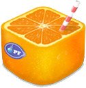
Most non-Mac users will mock our appreciation of nice application icons, but I honestly don't care - let me profess my love for the Tangerine icon here and now. It's superb. The app itself looks pretty swanky too, though for my taste, it mimics too many iTunes features I might as well use in iTunes (if Tangerine were, say, a plug-in instead of a standalone app). But that's not really a complaint, just a side note.

Analysis of my 3,800-song library took about an hour and a half on a PowerBook G4. That's not stellar, but it's also not like I needed that punk playlist immediately. After this I went to create my first playlist - something fast and intense, my weapon of choice for dishwashing, dusting, and other household chores. I went for a BPM range of 130-200bpm and above-average intensity. I was surprised to find only these two settings (including a distribution curve).

The results were sorely disappointing. Included were a number of scratchy 1930s jazz cuts, and some of the mellowest tracks by Tricky, Can, and Beck (trust me, they were pretty darn mellow). I pushed both the BPM and the intensity up and got similar results - while some of the tracks were what I would put in the "fast and intense" category using my cerebral analyzer, they made up 10-20% of the generated mix.

Just about the only way I was able to create playlists that matched my expectations of fast/slow and mellow/intense was by picking from one of my carefully assembled iTunes Smart playlists. Which had me wondering why I was using Tangerine at all - a quick comparison of purely random iTunes lists using a somewhat selective playlist and Tangerine playlists seeded from the same pool with the added BPM and intensity revealed no appreciable difference between the two.

Maybe I was doing something wrong. Or maybe my music library is wacky somehow. In any case I found that Tangerine, while pleasant to use, did next to nothing for me - and not because I'm not in its target market. I have dozens of Smart playlists I regularly use. They were one of the things that impressed me the most about iTunes.

Sorry, you sexy citrus - maybe next time.

Labels: , , ,